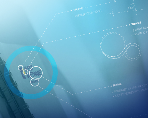
The refresh of Quest Software is based on their tagline, Simplicity At Work, which reflects the company's capabilities to simplify complex IT issues for their customers.
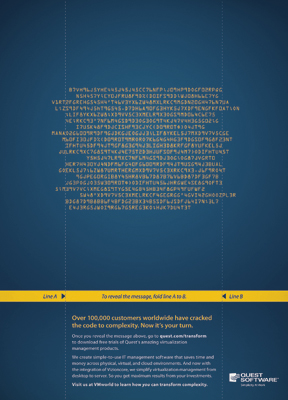
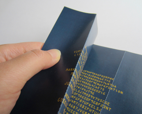
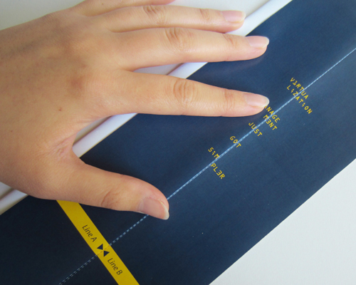
This advertisement is a riddle meant to be solved by the viewer, essentially by lining up the two dotted lines to transform the indecipherable code into a simple message.
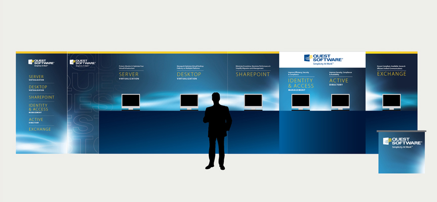
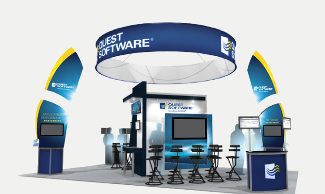
Given the historic and immutable logo, the team formulated a new meaning to their identity. Three light beams bursting through an open door represented the simplification and illumination that Quest provided, and became a recurring design element throughout various design materials, such as the tradeshow and brand book.
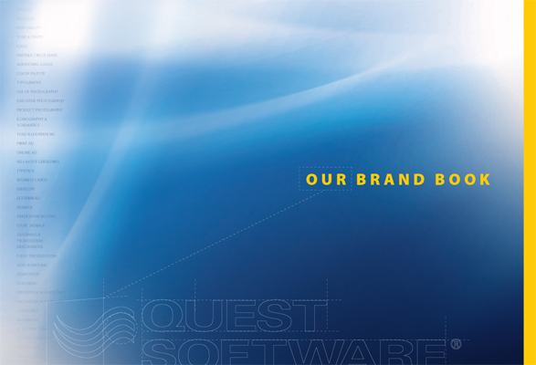
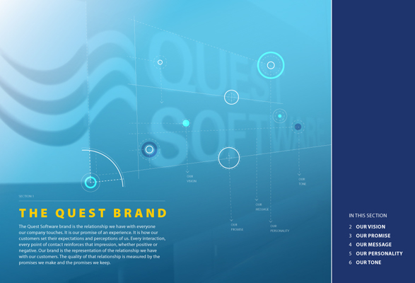
A few title pages from the brand book.
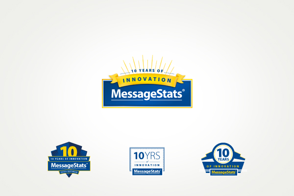
The mark for the 10 year anniversary of MessageStats. The three smaller marks are some other explorations.
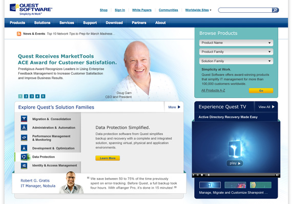
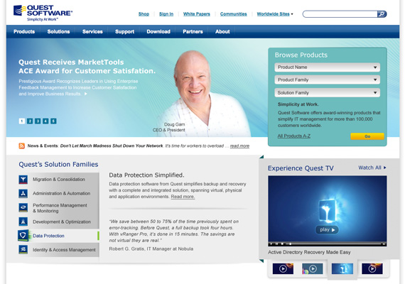
Website enhancements.